Realistic web design trends for 2020
Every year there are some excellent blogs on the various design trends for websites and you can pick up good ideas for yours. However when deciding what you want for your business have in mind that not all trends will work for you. And this is absolutely fine.
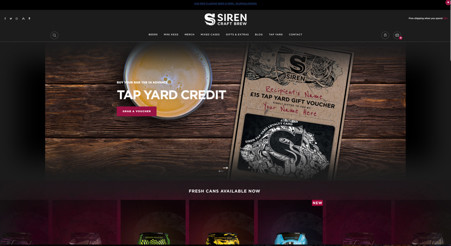
As an example, a lot is made of “Dark Mode” for 2020. This design idea (which has actually been around forever – check out the IBM monochrome monitor) can work well for some businesses. Here it works well selling Craft beer..
But here it works less well if you are for example a care home in Banbury..
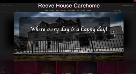
Although that is an obvious and a bit silly example, there are never-the-less trends that should be used and some that should be avoided depending on your sector.
So what trends should you consider and what design ideas may not come under the category “trends” but are still rock solid?
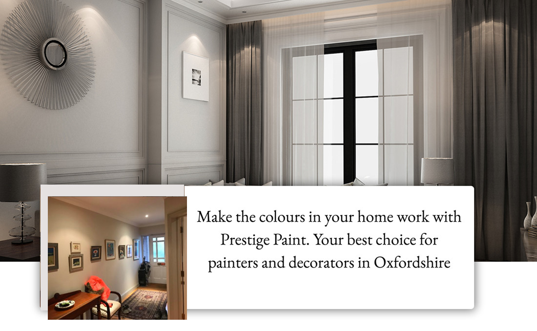
Maximising white space – Keeping it simple.
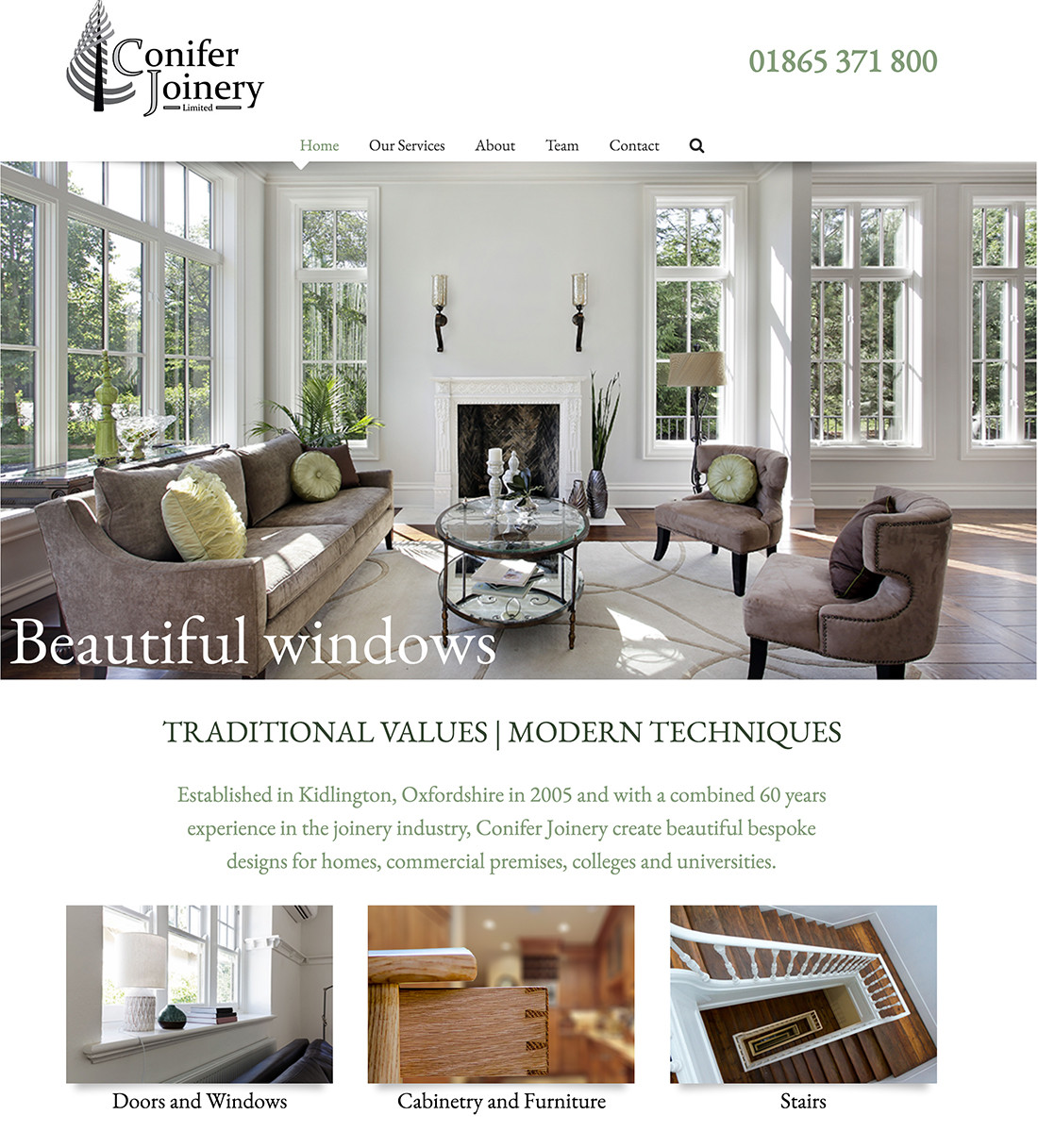
White space doesn’t overload your visitor and allows them to find the information they want easier. This makes for a better user experience. Some clients constantly want to reduce white space to pack more information in and often this is a mistake.
I would always consider this option as it works well on all devices.
In this example, it is easy to go and find the section on “Doors and Windows”.
3D Images
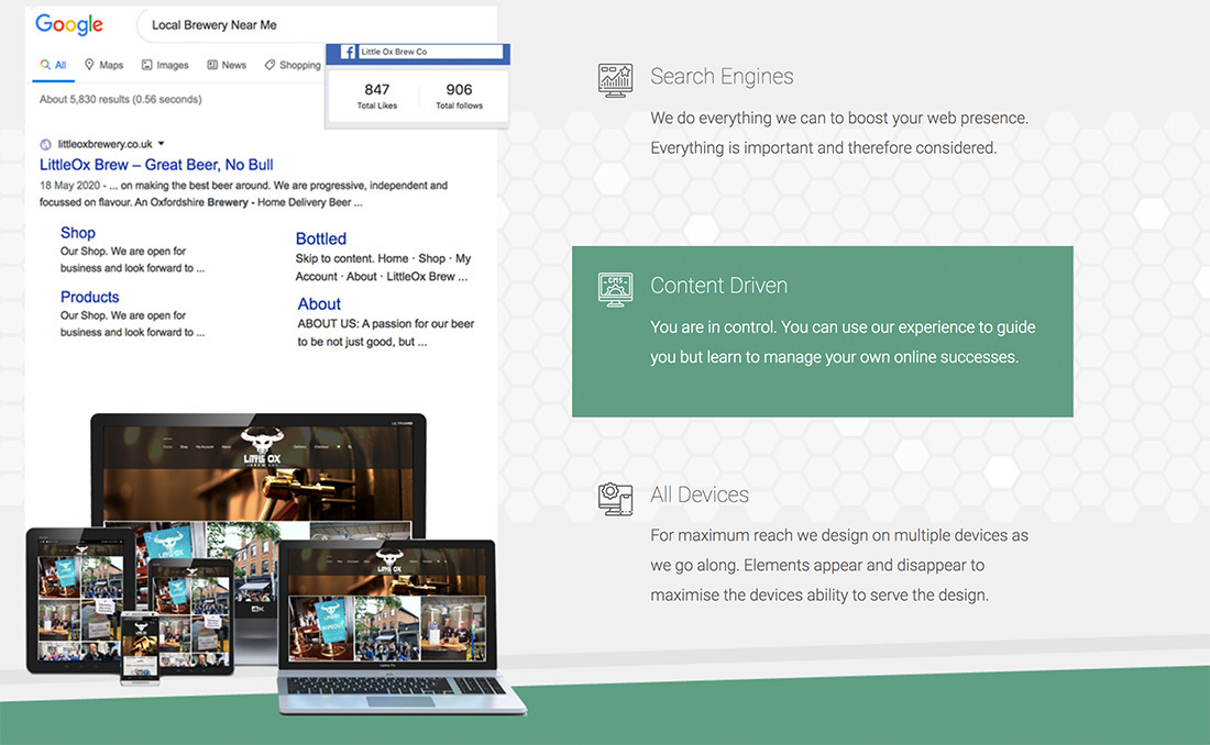
This is definitely a trend that is getting more prominence on today’s websites and can work well for you. This effect gives the pages more depth and usually you combine this with a suitable background to maximise the effect. Our homepage has a good example of that.
Overlapping Panels
Plenty of articles suggest this is trending for 2020 but again it has been around for a while. It can work well for every business website and you should consider it especially if you introduce a small movement effect. It makes the central message or strapline stand out.
Artist Illustrations
An artist illustration can transform a potentially challenging page of information into one that you are willing to try and read. Some content just needs a lift, not because it is not well written but because some of the information needed to be expressed can be a bit.. thought-provoking. A good artist can make that happen without dumbing down or trivialising the page.
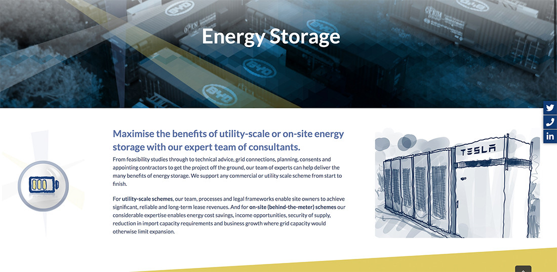
We love all the art work on our Roadnight Taylor website. They had a lot of content and it worked really well in providing a counter balance.
Multi Media
Done well, this transforms a website. It is definitely worth working with agencies or individuals who can help you introduce video, time-lapse and sound into your business website.
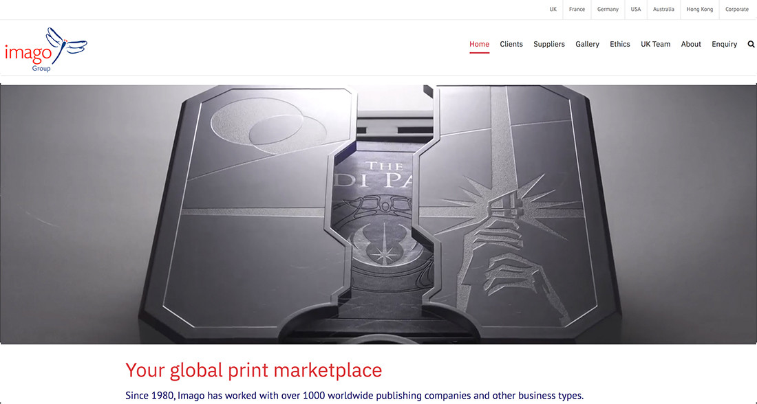
Back to Roadnight Taylor, the video interviews and drone footage are fantastic, but have a look at imagogroup.com homepage video. This illustrates who they are and what they produce for their clients perfectly.
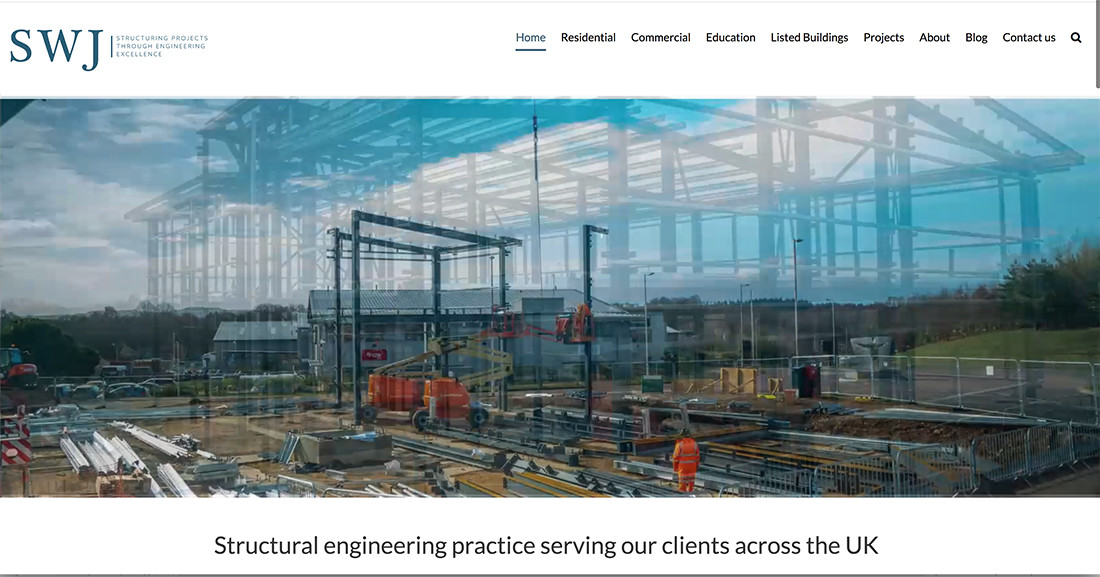
If you make or build products or run a service business to clients who do, time lapse videos can be a great way to add impact to your website visitors.
We loved this one on our SWJ website.
Many other design techniques and effects come under “trends 2020” and a lot are improvements on past trends. Background colour gradients or font experimentation have been with us for a while and there are some great new designs.
With all these trends and effects we need to make sure we know that the web designer has tried to show off the business rather than how good the business website has showed off the web designer.
So whatever design you go for, look at the latest trends and match one or more with more traditional web design concepts so you are current but still accessible and appropriate to your audience for it is the audience that matters and they need to easily find what you are wanting to sell.


Leave A Comment
You must be logged in to post a comment.